Obligo is solving for the complex and outdated rental process, which means harnessing new financial technology to power our solution. We use AI and Open Banking technology to qualify renters for deposit-free living — a relatively new concept to many.
Therefore, it’s critical for Obligo to earn the renters’ trust with necessary security measures, while avoiding too much friction in the workflow. To achieve this balance, we set out to build an outstanding, user-friendly experience.
Here are the top 5 principles we always follow to achieve this goal:
1. Know Your Users
A deep understanding of our audience is fundamental for creating a successful user experience. At Obligo, that means understanding renter expectations, concerns, and motivations. It helps us answer the most critical question: “How can we power the best possible renter experience?”
Different users have varying needs and expectations. Some renters are more tech-savvy and familiar with open banking or bank account verification. They can easily handle online processes, from linking their bank account to uploading identification documents. Other renters might need a little extra help and guidance, which requires clear instructions and a simple process.
To ensure we build an easy-to-use workflow, our product team runs multiple A/B tests to optimize the copy, graphics, and flows. We also run usability tests and collect feedback from renters in real-time.
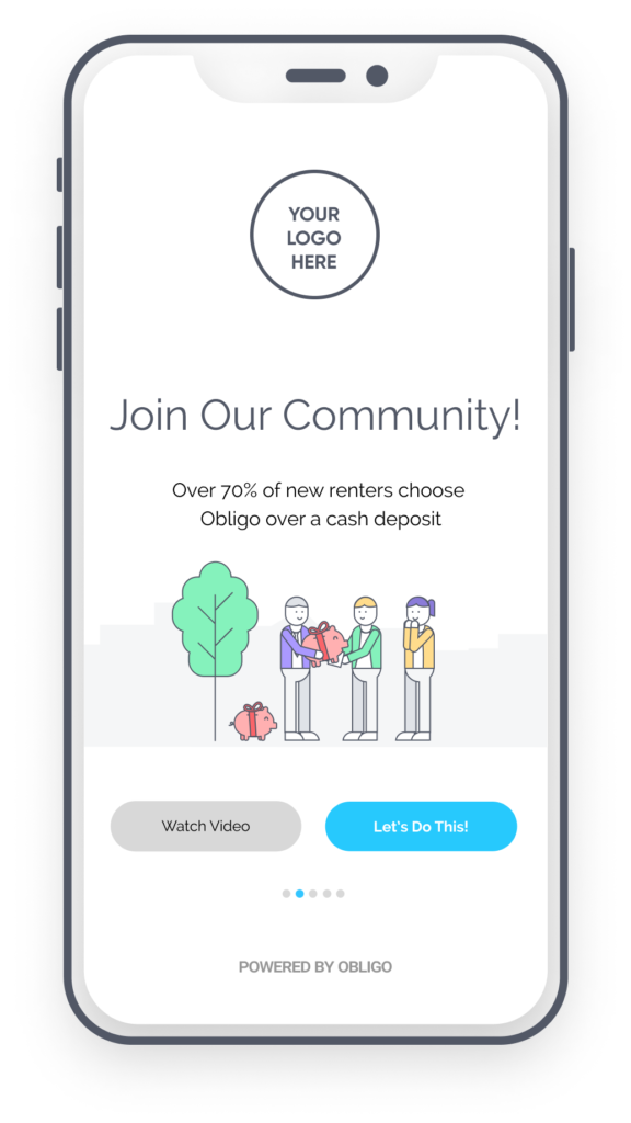 2. Keep Things Consistent
Having an inconsistent user interface is like trying to communicate in several different languages.
To ensure we’re describing our deposit-free solution to renters in a digestible way, we always maintain consistent terminology across platforms, including our website, support channels, and the renter-facing screens.
Visual and functional consistencies are also essential for a product’s learnability. We use a detailed design system to ensure fonts, sizes, and buttons are consistent across the product. Functional consistency is especially important for actions like providing financial information or adding a payment method, to ensure users feel safe and secure.
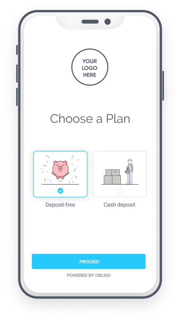 3. Be Transparent
Obligo’s mission is to build trust between renters and landlords by harnessing financial technology. As such, we require some basic financial information from renters in order to qualify them for deposit-free living.
How do we ensure renters feel comfortable during the sign up process? By creating a transparent experience.
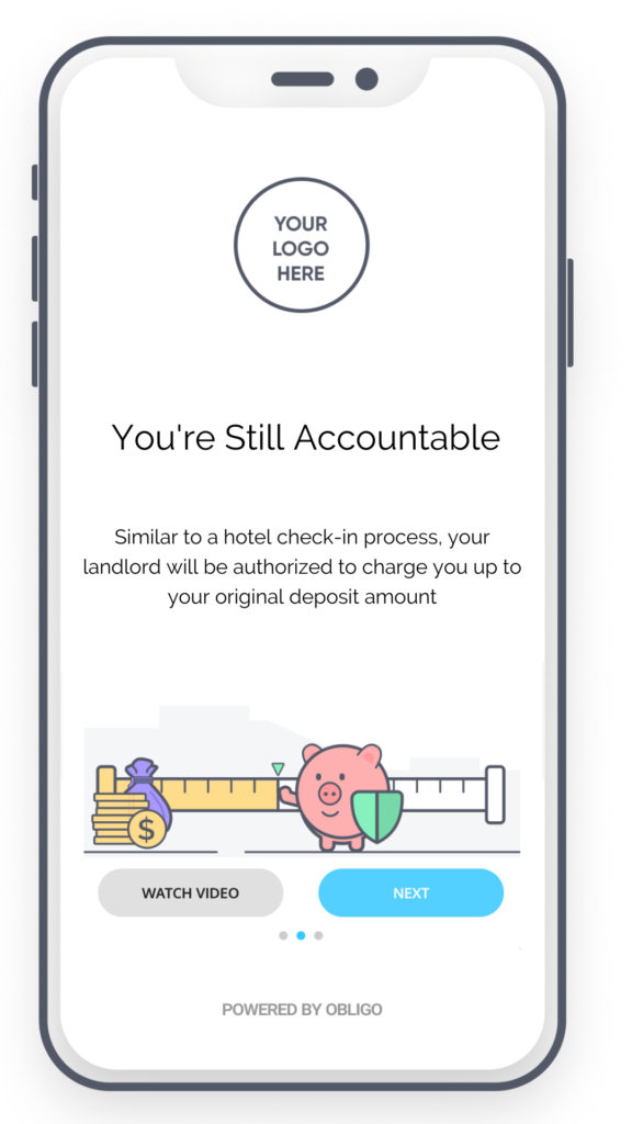
Our help center widget includes the most common questions and answers renters might have regarding our deposit-free service. We present our terms in the most straightforward way possible and elaborate on the details. It’s essential that deposit-free renters understand they are still accountable for damages or missed rent, as well as understanding that they will pay us a small service fee in order to live deposit-free. Transparency is absolutely key.
4. Use Simple Navigation & Show Progress
The move-in experience with Obligo is divided into several steps. First, the renter gets to know Obligo and learn about our deposit-free solution. Then, they complete a quick signup process and verify their identity. The next step will require the renter to provide authorization to one or more billing methods (a credit card and/or US bank account) to proceed with qualification.
Obligo will use an open banking connection to run a lightning fast series of tests to ensure that sufficient funds are available in these accounts. We have created a super user-friendly navigation system, and we’re working on a progress bar to help renters feel in control and understand what they should do next.
When a renter starts the move-in process or comes back to the process after a pause, they can clearly see their status and which steps await them.
5. Bring Joy with Beautiful & Clear Designs
Let’s be honest: paying security deposits, confirming bank accounts, verifying personal identity… These are not usually associated with a fun and delightful experience.
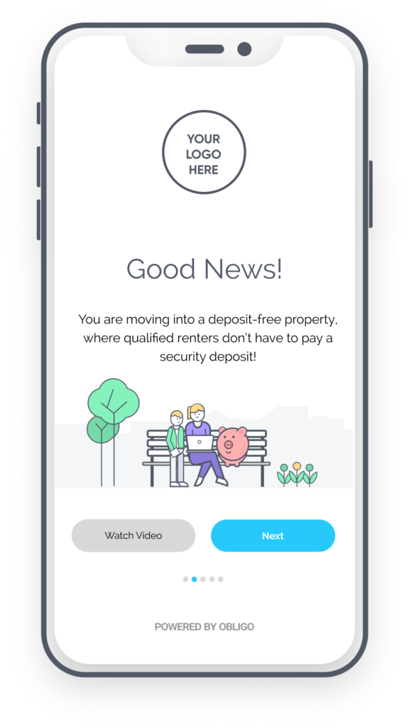
We believe that bringing joy to the user experience boosts motivation and confidence. We want renters to be enthusiastic about their opportunity to live deposit-free and keep their cash to invest, save, travel, or spend.
Our designers use colorful animations and illustrations to explain and visualize our deposit-free service and we reduce cognitive load by keeping the design clean and simple.
 Power A Better Renter Experience
We believe in providing renters with a consistent, transparent and simple user experience that gains their trust and delights them every step of the way. At Obligo, we follow these principles so that property owners and managers can do the same for their residents.
Learn how Obligo’s deposit-free living helps power a better resident experience, schedule a demo today!




Leave a Reply